Appara
Beyond functionality:
Elevating visual identity through UI design
Appara is a Vancouver based legal technology startup. They've built a powerful document automation and record management platform with software that streamlines workflows for corporate law firms, reducing task time from hours & days to minutes. Through my internship at Design for Startups program, I joined the Appara team as a UI and Interaction designer, and redesigned their website from start to finish and revamped their visual identity and marketing assets.
00 Project Overview
Client: Appara
Timeline: Spring 2021
Team: Zahra Jalali
Role: UI/IxD Design, Visual Design, 3D Design

Design Goal
The project aimed to revamp Appara's website to highlight their new product range and match the visuals with their brand's identity to better communicate with their audience. To reach this goal, I suggested to start by redesigning their logo as well which was not highlighting their modern and high-tech attributes.
Targeted Audience
Appara provides start-to-finish document automation and records management software. Their key audience are lawyers, paralegals, and other employees in law firms who are looking to digitize their workflow, which became essential after the pandemic.
01 Project Background
Logo Redesign
The main strategy in redesigning the logo was to emphasize the multi-entity aspect of Appara's apps, and its time-saving feature. The previous logo featured an image and an emphasis on "para" (short for paralegal), all highlighting the legal component. Meanwhile, Appara is constantly evolving and is expanding its products beyond legal solutions. To highlight this transition, I designed the new logo to highlight the letters "App" which implies the essence of Appara as a tech solution, and the icon speaks to its multi-entity component. The color pallet was remained the same to reinforce brand's image across existing apps.
Old Design


02 Research & Findings
Heuristic
Evaluation
Before starting the design process, it was important to analyze the previous website in terms of functionality and UI.
Some of the existing issues:
-
Problematic user flow
-
Outdated & generic elements
-
Unclear hero images
-
Long scroll

Competitive
Audit
To further identify the design strategy, I conducted a competitive audit. This task provided me with insights on common approaches in UI/UX design, whether they work or not, and spaces of improvement and distinction for Appara.

03 Design Process
Wireframe
After determining the user's goals and needs, I began sketching wireframes for the website. This process was highly iterative and took place while working with the product manager, and getting feedback from stakeholders, product developers, and other team members from the sales & marketing department to discuss information structure throughout the website. This part was crucial and collaborative as we had to determine content, copywriting, while developing concepts for images which all influenced the website hierarchy and layout.


Prototype
& Usability Testing
After finalizing the wireframes through in-house testing, I moved forward to the visual design. To communicate Appara's products, we had to come up with a visual style that would simplify the complicated tasks of the apps and demonstrate a clear representation to potential customers.
After several iterations on the website design, a heuristic evaluation was conducted on the prototype (by Kuzi Mutonga, project manager) with the customer success team to detect usability problems. The consulted team were directly in contact with the company's clients and had already known about their struggles and common inquiries.

04 Outcome
Visual Design for Appara
Iconography, Hero images, Visual Style
Designing the visual assets was one of the most important tasks in this project. The color palette had remained the same from the previous website but I created some new color variations to have softer transitions. Over 20 icons were designed to relate to the different products and features while being consistent and in line with the company's visual identity.
For the hero images, after ideating several styles, we landed on a combination of 3D and flat illustrations to be able to integrate images from user dashboards and still be able to include creative demonstrations of the tasks.
-
Flat illustrations: provide a warmer, more welcoming, and pleasant experience while also being memorable and adding value to the brand’s visual identity. All the illustrations were specifically designed to match the webpage content, and the copy.
-
3D visuals: showcasing the software’s dashboard in a clear and engaging way.


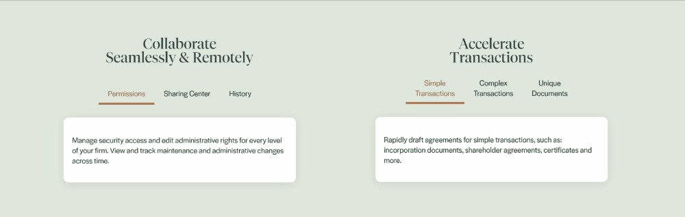
Interaction Design
for Text-Heavy Webpages
The main challenge in this project was the text heavy content that had created long scrolls and illegible text in the previous website. It is important to mention that the key users of this certain platform, lawyers and paralegals, are rather comfortable with lengthy text due to the nature of their work. However, I tried to come up with multiple design strategies in interactive components to limit the amount of visible text at a time and create an enjoyable experience.


Style Guide
After finalizing the final prototype and visual assets, I created the style guide and handed over the assets and prototypes to the developer to get started with building the website.


05 Reflections
Impact
Appara's new website launched at the end of Spring 2021. The new design and visual marketing assets has driven significant traffic to the website and has improved loyalty among customers.
Learnings
-
Designed over 20 webpages, and a whole new set of visual assets, all of which went through several iterations.
-
Discussed and presented design solutions to multiple stakeholders and collaborated with non-designer colleagues to achieve best results.
-
Collaborated with the website developer and delivered needed assets and a detailed style sheet.
-
Experienced and learned about designing for a startup as a solo designer.